 It’s all in the details…
If you are a regular follower of our page, you would have been kept up to date with the apartment renovation we recently completed. If you aren’t and you’re new here, welcome! Have a read of our other blogs too
We have previously released before and after photos and even a video of the completed transformation!
As with any renovation, the small details are so important and really make your space unique.
We are taking the time to explain some of the small details we included as part of our design service.
Let’s start with the kitchen…
One of the most important aspects of renovating an apartment is remembering that there isn’t much space or storage. The kitchen is considered the heart of the home, we needed to get this design perfect.
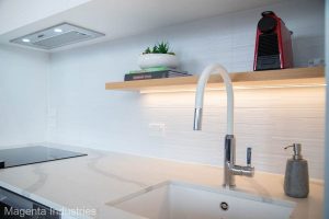
Firstly, we needed to make sure we made the most of the bench space. This is where the floating shelf idea came in. It allows for everyday items to be stored in plain view and leaves the bench free. Adding the LED strip light underneath lights up the bench and looks great!
We wanted to keep the white colour palette throughout, we managed to incorporate a white sink insert and a kitchen tap with a white spout. The tiled splash back, while also being white, is textured for that little something extra.
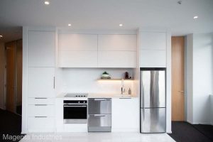 Utilizing all the space we had in the kitchen, we decided to take the cabinetry right up to the ceiling. To allow for functionality, the top cabinets are a push open design, with a pull down shelf, making it easier for you to access items (no step ladder required).
There are 2 LED lights in the ceiling close to the cabinets, the addition of these lights creates a warmth over the whole kitchen.
Now onto the bathroom…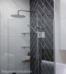
Firstly, we absolutely love the black herringbone feature wall in the shower! The herringbone pattern has been laid with black tiles and white grout to really make this wall stand out. Black can be a scary colour to use, we were confident the room could take it with the majority of the apartment being in a white colour palette.
The bathroom was a whole lot of fun to design. It needed a lot of added storage while still looking great and blending with the rest of the apartment.
We created a custom cabinet design that had a huge amount of storage above the vanity. We added some wood tones with the open shelving and put mirrors on one side of the cabinetry above the vanity sink. The highest cupboards have the same lift up feature as the kitchen cupboards, making them great for everyday use. 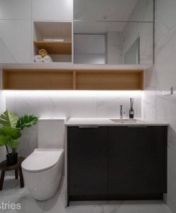
The vanity was also a custom design to fit into the space and has the same bench top as the kitchen. On the left hand side is a pull out laundry hamper, great way to discreetly hide your washing!
With a lack of windows, we added an LED strip light on the wall to brighten up the room.
We love utilizing LED strip lighting, it adds a touch of luxury that wouldn’t otherwise have been there.
And finally for the mirror. Placed on the right hand side as you walk into the bathroom, this mirror is huge! It took some very careful planning to get it into the apartment, then onto the wall. But with great design comes some difficulty.
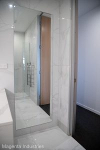 We placed the mirror here to make the bathroom feel bigger. Mirrors are excellent for use in small rooms. Their reflection makes the room seem much larger than it is.
As well as working some magic, it’s an excellent feature to have in any home.
If you’re planning a renovation and love our ideas, get in touch with Sara to see how she can transform your home!

